BMC Design System
BMC was founded on a deeply felt principle: help customers maximize their technology and drive better business outcomes. We do that by connecting and optimizing digital operations to create an AI-powered engine for continuous innovation.

01
About this project
The creation of a scalable and adaptive design system for a leading tech company resulted in improved design consistency across platforms, a reduction in development time, and enhanced component reusability. The system addressed key issues in the existing UI kit, including outdated visual controls and a lack of adaptability, and was developed through close collaboration between the design and development teams, using Figma as the primary tool.
Methodologies/Tools Used:
Design audit, component library creation, design tokens, Figma, user testing, collaborative design sessions
02
Introduction
Project Description:
This project aimed to overhaul and create a scalable design system for a tech company’s product suite, which required design consistency across web and mobile platforms. The initial UI kit was fragmented and lacked adaptability, making it difficult for designers and developers to create a unified user experience. The new design system was built to ensure cross-platform consistency, improve the speed of design-to-development handoff, and modernize the visual identity of the product.
Context:
The company was expanding its product offerings, and the existing UI kit had not been updated to keep pace with new features and platforms. The growing complexity of the product ecosystem required a more flexible and reusable design system to scale efficiently across web and mobile applications. Challenges included the lack of a token system, non-standardized components, and outdated UI patterns.
Project Goal:
• Create a unified design system that works seamlessly across web and mobile platforms
• Reduce development time by 35% by enabling component reuse
• Modernize UI controls to improve the visual appeal of the product

03
Challenge
The Challenge:
The primary challenge was to build a design system that could be easily adapted for use across multiple platforms, while resolving issues with the original UI kit. These issues included:
• Incorrectly assembled or insufficiently elaborated components
• Lack of a token and variable system for easy theme customization
• Outdated UI controls that didn’t align with current design trends
• Limited adaptability of components and styles across different platforms
My Role
As a Middle Product Designer, I was responsible for leading the effort to create a consistent and scalable design system. This involved working closely with the design lead and collaborating with developers to ensure that designs were translated into reusable components. My primary tool was Figma, where I designed, documented, and iterated on the component library. I also played a key role in integrating design tokens and ensuring that the system could be easily adapted for future needs.
04
Research & Analysis
Analysis of the Existing UI Kit:
The existing UI kit lacked flexibility and scalability, which led to inconsistencies in the user interface across different platforms. Some components were either incorrectly assembled or not sufficiently detailed for developers to implement effectively. The absence of a token system made it difficult to apply consistent styling, especially when handling theming or platform-specific adjustments.
Problem Identification:
• Non-standardized components increased the development time and required frequent customizations.
• Outdated UI controls made the product look dated, which negatively impacted the user experience.
• Lack of adaptability in styles and components created inconsistencies between mobile and web versions.
These issues affected both the user experience and the internal workflow, leading to inefficiencies in the design-to-development process.
05
Design Process
Solutions:
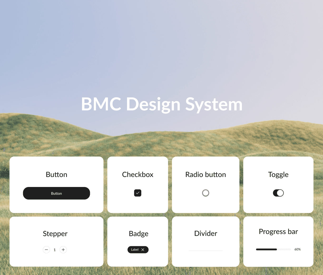
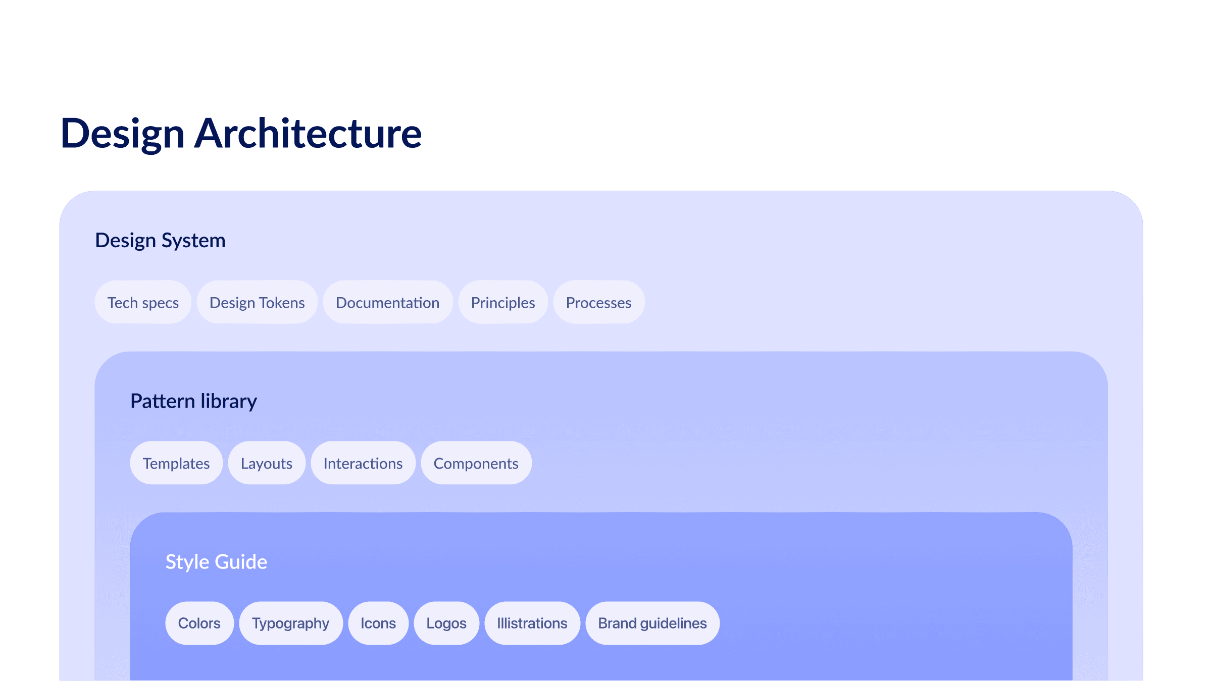
• Developed a comprehensive component library with standardized components, including buttons, forms, and navigation elements, that worked seamlessly across platforms.
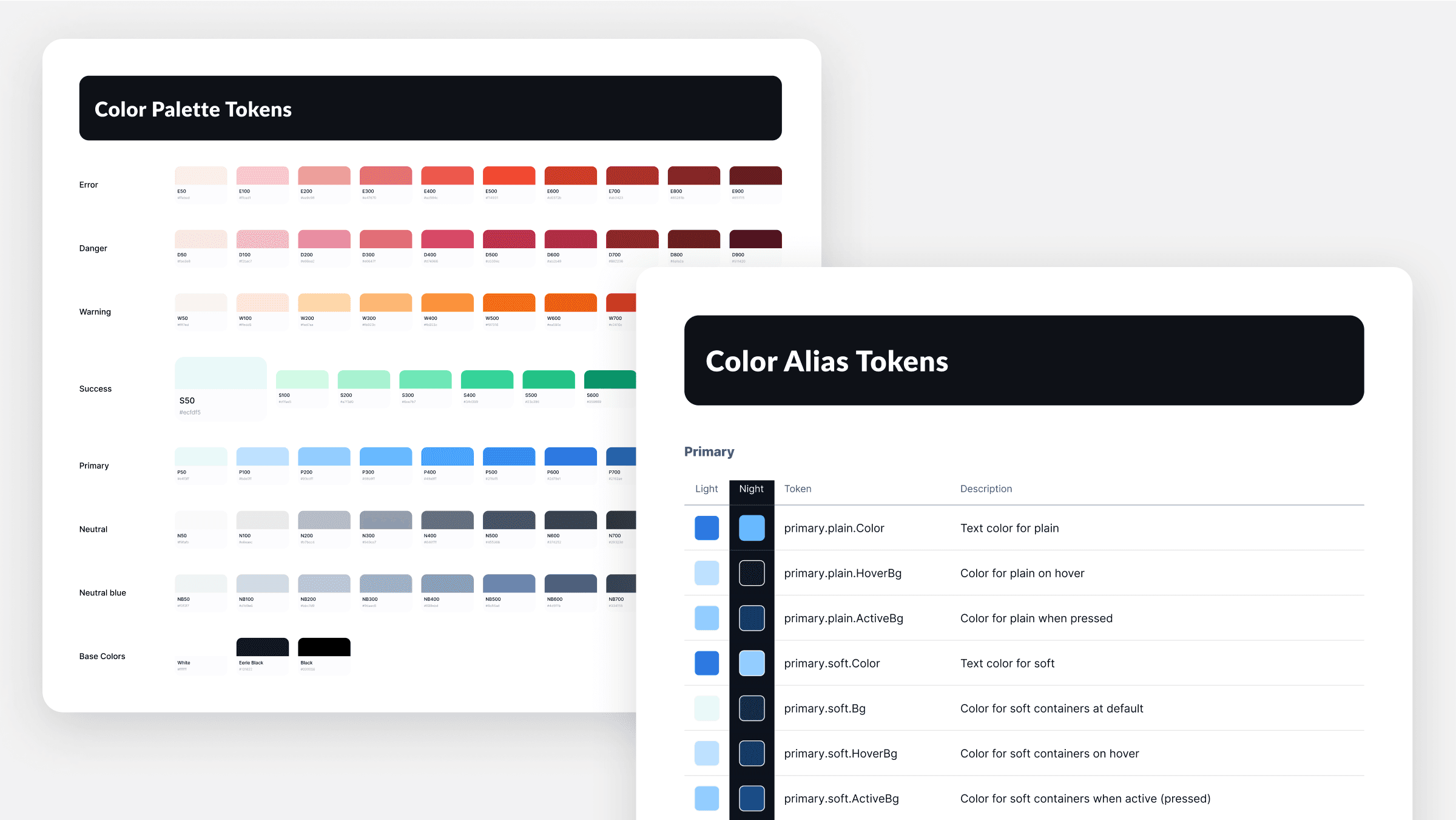
• Introduced a design token and variable system that allowed for easy theme customization and consistency across multiple applications.
• Modernized UI controls to match current design trends while ensuring accessibility.
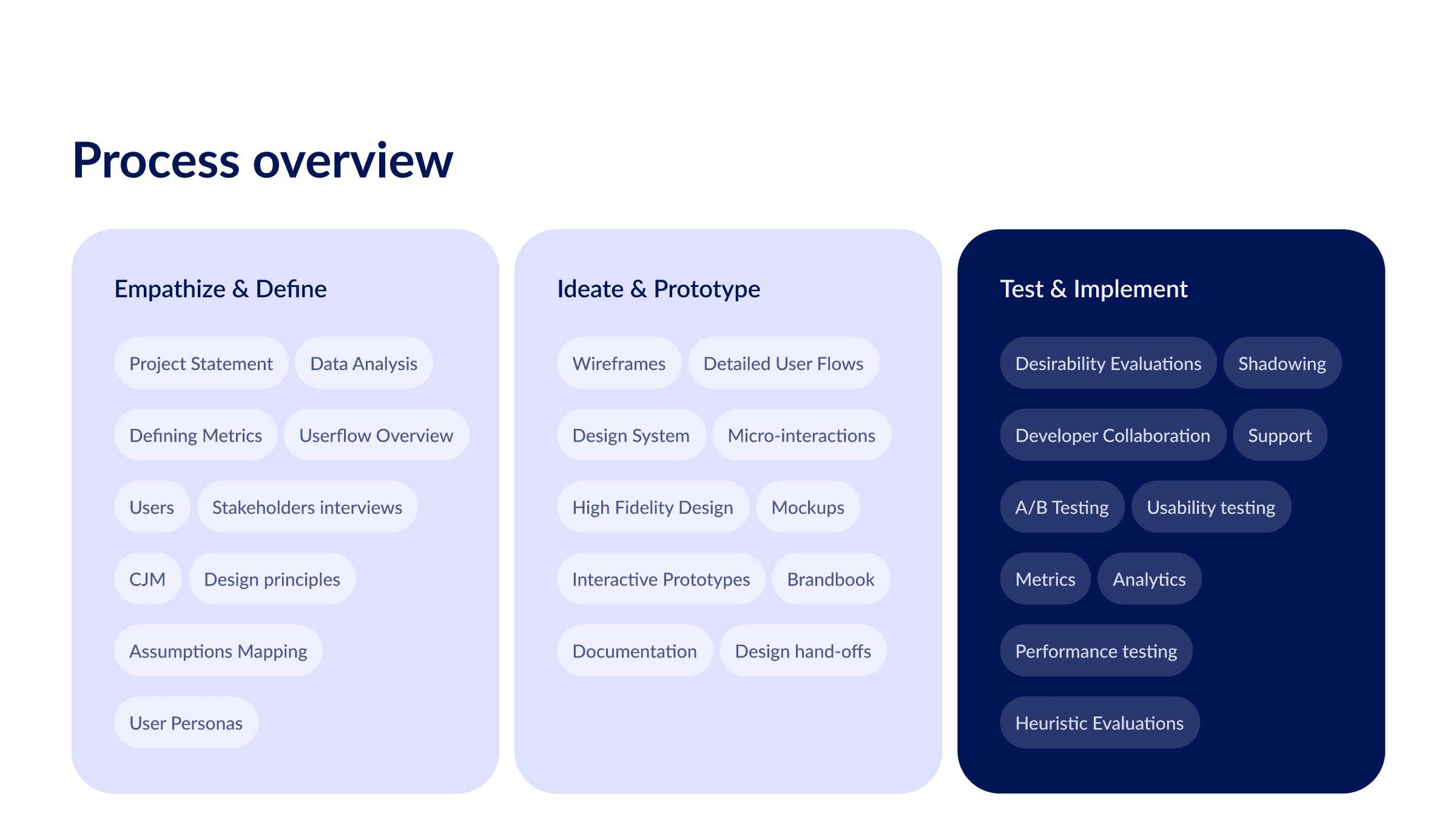
• Documented the design system thoroughly to make it easily usable by both designers and developers.
User Testing:
User testing was conducted to validate the new components and ensure that they met the needs of both designers and developers. Feedback was gathered on the ease of use, adaptability, and scalability of the design system components, leading to several refinements in the final version.
Iteration:
Based on user feedback and testing results, we iterated on the design system by refining component details, improving documentation, and enhancing adaptability for various platforms. This iterative process ensured that the system could scale effectively as new product features were added.

06
Results
Metrics:
• Design-to-development time was reduced by 35%, thanks to the reusable components and streamlined workflows.
• Component reusability improved by 50%, as measured by internal developer feedback.
• Visual consistency across platforms was achieved, leading to a more cohesive user experience.
Supporting Evidence:
We created charts showing the reduction in design-to-development time, as well as feedback from developers indicating improved efficiency and reduced need for customizations.
Lessons Learned:
This project emphasized the importance of having a scalable and adaptable design system to support the growth of a product. Collaboration between design and development teams was critical to ensuring the success of the project. In the future, I would focus on building a more dynamic design token system earlier in the process to accommodate platform-specific needs even more efficiently.
